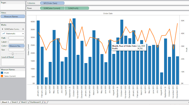
When you have a simple chart like below, sometimes you'd like to see some reference lines being overlaid into the chart to give you that little extra information you need.
A simple way to do this is by selecting the axis that you'd like to add the reference line, e.g.
the Sales axis from the graph. Then right-clicking the particular axis.
Select "Add reference line" from the popup menu.
Press ok once done.
You can add multiple reference lines just by repeating the same process above on the same axis.
You can also edit or delete the reference line created by right-clicking the particular axis, and choose the reference lines you'd want to edit or remove.
Cheers! :)


