Hi guys, Its been a while but man oh man it has been an exciting time for us. New ventures, new customers and a new version of Tableau in the horizon.
Today however I delve into something that I have been trying to work on, but didn't have the time to actually explore it, which is creating custom filled maps in Tableau 7. Everybody who's using Tableau 7 by now would have been familiar with filled maps. It is a nice feature that enables you to quantify measures by filling colors to the map boundaries. As seen in the sample from our sister blog
Datalore:
This is all well if your data is in the US, but for us Malaysians, we can see our detail at the state level, and nothing more. So I set up to find out how to actually create custom filled maps for more refined representation in our map.
If you scour the interweb, there are quite a number of good tutorials on how to achieve this, the two most comprehensive, IMHO would be using tha shape2tab tool and TabGeoHack, accessible below:
shape2tab:
http://community.tableausoftware.com/message/173304#173304
TabGeoHack:
http://www.clearlyandsimply.com/clearly_and_simply/2012/03/create-your-own-filled-maps-in-tableau.html
Which method for you is your cup of tea, but I'm using TabGeoHack, and I'll make a summarized version according to my own tests on our entry today. This guide is only serve to give an idea on what to do, it should be enough for you to start on, but I do strongly encourage you to read the full guides.
Step 1: Download the files and unzip
1.
TabGeoHack (the tableau custom shape tool)
2.
GDAL 1.9 (geographical library)
Download the files and unzip, I'd like to make things simple and put TabGeoHack in "C:/TabGeoHack"
and GDAL in "C:/GDAL".
Step 2: The general settings.
TabGeoHack uses an xml file called YML, the details of YML can be read in the comprehensive TabGeoHack guide above, but suffice for you to find this file:
tabgeohack.yml in your TabGeoHack folder ("C:/TabGeoHack/tabgeohack.yml" in mine).
Open the file with a text editor like Notepad, Notepad++ or Editplus and change the red colored text below to your own path:
So the Tableau repository should be in "C:\Users\<USER>\Documents\My Tableau Repository"
And the GDAL path should be the place where you unzip the GDAL installer. Remember, The GDAL path should be the path where you have the bin folder as below:
Step 4: Get or create shape files
In the Open source community there is a very powerful tool for any GIS work called
Quantum GIS, here you can create your own custom shape files and export it into ESRI shapes, just remember that Tableau uses ESPG:4236 or WGS84 if you make your own.
But for the purpose of this entry, i'll be using the same site as suggested in the comprehensive detail by downloading from here:
-
GADM website
for the Global Administrative Areas of Malaysia that includes districts, which is not available in Tableau 7.
Download the file and unzip. You can put it anywhere you like but you'd have to set the PATH in the environment settings, personally I just create a folder in TabGeoHack's folder for Malaysia. e,g. "C:/TabGeoHack/Malaysia"
Once you have unzipped the folder, the shapefiles would contain several different file extensions, but you pay attention to SHP files, which should also be the biggest size among the lot. For example in my "C/TabGeoHack/Malaysia" folder I would have as below:
Step 5: Creating your own YML configuration file.
Now comes the slightly difficult part for the unfamiliar, you have to create your own YML file to be used to process your custom shapes for Tableau. First, you need to copy a sample YML file in the Samples folder "C/TabGeoHack/Sample". There should be a file named "Porirua Tsunami Warnings.yml". Copy this file to your TabGeoHack root (e.g. C:/TabgeoHack") rename it to your project, in my case I renamed it to "Malaysia.yml" and then I open the file. Here you'd see quite a mess of information, so clean it up first say like below (pay attention also on the red bubbles):
*Note: Daerah means District in Malay.
Change the location of your source shapefiles and ourput folder in the first Bubble, say mine is "C:/TabGeoHack/Malaysia".
In the second bubble, you can remove any irrelevant data from the sample and you can add in the shape file you want to use. In my case there are 3 *.shp files : "MYS_adm0", "MYS_adm1" and "MYS_adm2". Each one representing Country, State and District, since I'm only concentrating on district, I chose "MYS_adm2" as my shapefile. Save this file for later, because the next set of information relies on the next process.
Step 6: Using TabGeoHack --info option
In order to know which fields that we can use in our shape file, we have to analyze its content, this is the first part of using TabGeoHack. Unfortunately, TabGeoHack doesn't have any fancy GUI, everything is command prompt. So fire up the command prompt from your start menu, by pressing start and searching cmd.exe, then run it. Go to TabGeoHack directory and enter the command:
"tabgeohack --info Malaysia.yml"
Of course, replace Malaysia.yml with your own filename.
Ok, now we can complete the configuration, with this we can add to Tableau's custom Geocoding. Depending on your shapefile configuration, there are a few information that Tableau needs. A unique ID is a must and also the name of the district that we are about to add. Therefore, in my case, since I'm adding district data, I'm going to take ID_2 for the district ID as a unique identifier, and Name_2 for district name.
Now my Malaysia.yml config file looks like this:
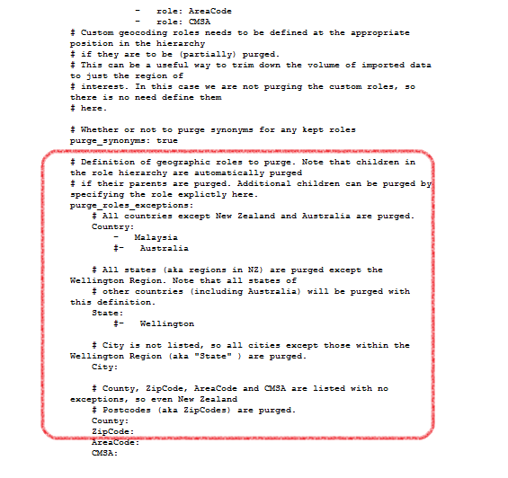
Do take note of the purging option, by enabling purge_synonyms as true
, it allows you to only load the necessary geolocation and ignoring others, so if you only want to focus on a certain country, state, city etc, you'd have to incorporate this into the config file, but in my case, I just set
purge_synonyms as false, even though it could hinder performance, but my district boundaries isn't that much so I can risk it.
There is an important note regarding purging, I'll explain it in the next step.
 Step 7: Generate the custom geolocoding and import it into Tableau.
Once you have completed the configuration, you can generate the custom geocoding with TabGeoHack.
At the command prompt, still in the same path, type the command below:
"tabgeohack --roles Malaysia.yml"
You should be seeing this:
And in your shapefiles folder ("C:/TabGeoHack/Malaysia/" in my case), you should be seeing a few folders being generated, most importantly, an folder called "Custom Geocoding Files" should be generated containing a generated CSV with the latitude and longitude generated from your shapefiles.
Now open Tableau, go to the main menu and select Map --> Geocoding --> Import Custom Geocoding.
The import process depends on how much data you are inserting and also if there are any errors or not. For example, in my configuration. I used the english word for "District" as my District ID and Name, Tableau threw me an error because the word District is already taken by Tableau. So I renamed "District" to Daerah, which is the Malay translation.
Note on purging:
If you enable it, purging causes all the purged locations inaccessible from your workbook or other workbooks that has locations beyond your custom ones. In order to get back the other locations, you have to remove the custom Geocoding from the Map menu. Don't worry though, you can easily reactivate the Custom Geocoding by running the TabGeoHack command below:
"tabgeohack --activate Malaysia.yml" (change the YML file name to yours)
Step 8: Linking the Shapes to the custom Geocoding.
The final step for this is to run the TabGeoHack shape option, after all of the above process is completed, simply run the command:
"tabgeohack --shapes Malaysia.yml" (change the YML file name to yours)
Ok we're done!!
Step 9: Test out your new Custom filled map.
So now we're done, just connect to your data with the new locations, create the workbook, and see the beauty unfold in front of your eyes.
PS: I know my map is not perfect, but hey I have just demonstrated successfully on adding Custom Filled Shapes with tableau. You can checkout for the better example at:
http://www.clearlyandsimply.com/clearly_and_simply/2012/03/create-your-own-filled-maps-in-tableau.html
And always don't forget, visit our website
http://www.venturess.com for exciting news on Tableau as well as other entries from our sister blog:
http://vss-datalore.blogspot.com/
-Zan


