Tuesday, 4 December 2012

FB ❤ Tableau

At the recent Tableau Customer Conference 2012 in San Diego, Tableau got several existing customers from big brands such as Facebook to talk about Tableau. Such big corporations will process millions of data a second, and Tableau's ability to tackle the big task of processing and visualizing these data, with such a phenomenal price range have instantly becoming a favorite with these companies.

Lets take a look at what Namit Raisurana is saying about Tableau in Facebook.

Jump to the link for the full story: http://bit.ly/FBloveTB

For more information on Tableau and to view our other blog entries, go to our website: http://www.venturess.com

Wednesday, 31 October 2012

Map Options

Hi guys,

Tableau's Geolocation or Map capability is one of the coolest features in Tableau.

It allows you to have a topographical idea on location based data.

Take a look at our sample entries at our sister blog here:

http://vss-datalore.blogspot.com/2012/10/malaysian-political-map-1986-to-present.html


http://vss-datalore.blogspot.com/2012/09/the-dawn-of-megatall-skyscrapers.html


Now besides the standard map that you see in Tableau, you can:

1. Change to a different map by adding a WMS compatible map at Main menu - Map - Background Maps - WMS Servers.


2. You can also change the color of the base map, this is enabled by default on the built in map, for WMS maps, it depends on the service provider.

Normal Map
Dark Map
Gray Map

3. Layers are also supported in the Map options, in the built-in map, there are a lot of US-based layers that you can utilize. For WMS maps, it is again, depend on the provider.


So please explore, and don't just stick to one single map option, hope you enjoy working with your maps now.

-VSS

Wednesday, 12 September 2012

Tableau, visual analysis for Enterprise solutions

With Tableau 7, a lot of the creases between other Enterprise-wide solutions be it CRM and ERP has been ironed out in the current version. Now, its easier and more economical to include Tableau's analytical and visualization engine into these Enterprise solution because of Tableau's expertise in visual query is unmatched, and the price that Tableau offer is far less.

Say for example a suite like SPSS, having added their own Viz Designer would not even compare to having Tableau, although they are heading the right direction, having the experience that Tableau has with interactive visualization coupled with the vastness of data other than SPSS to work with on, definitely Tableau is the clear winner.

And now companies are heading towards Tableau integration with their existing or future CRM or ERP systems in droves. Salesforce, for example have proven how easy it is this integration can be, and how Tableau's visual analytics engine is not just complementing their existing systems, but giving their presentations the extra edge with live, interactive visualizations that is insightful and decisive. Plus its also not so bad when adding all these features doesn't break the bank.
Salesforce CRM, tableau integrates with Salesforce, salesforce tableau integration, tableau salesforce integration
jump to the links below to get the full story on Tableau's superior analytical engine, and how Salesforce CRM is arming Tableau in its arsenal:


Sunday, 5 August 2012

Tableau on Mac

If you intend to run Tableau on Mac with no reboot and easily switch between OS X and Windows, here is the recommended tips:
  • Install Parallels in your Mac to host the Windows OS
  • Install Tableau on Windows OS
  • Memory suggested: 8G RAM

Wednesday, 1 August 2012

How pie charts are bad for your analytical health

The main reason when we visualize information in charts or graphs is to make it easier to interpret and compare information within, however, using Pie Charts have proven the opposite. Why? As Steve Fenton puts it


1. Pie charts made it difficult to compare individual values.

Nasty Euro Election Pie Chart

As this example taken from the 2009 BBC News European Election Results suggests, even though it is reasonably clear that the Conservative Party has the biggest chunk of the vote, it is definitely hard to see the difference between the next three parties, UKIP, Labour and the Liberal Democrats. It is also quite hard to tell the difference between the next two parties, Green and BNP. As the purpose of the chart is to tell the differences between each party, using a pie chart proves to difficult in achieving this.


Fantastic Euro Election Column Chart


Now if we compare to the bar chart above, it is so much easier to see the difference between the items.


2. The size of a pie chart wouldn't make any difference.

Shocking Tiny Pie
Awful Large Pie

From the same data as above, resizing a pie chart would not reveal anymore data, and the space taken to resize just to make it clear would only be a waste.


Excellent Tiny Column Chart
Stunning Huge Column Chart


Compared to the bar charts above, the smaller chart is already showing a clear difference between the columns, but when enlarged you'd get a more clearer picture of the differences.


3. Displaying combined values.


Disasterous UK Election Pie Chart

From the 2009 BBC News European Election Results above, if we wanted to see how would the Conservative party fare when say the Labour party were to join forces with the Liberal Democrats, its very hard to tell using the pie chart above.

Brilliant UK Election Column Chart
If we observe the same using our bar chart, we can clearly see that the combined party could have an edge over the Conservative party.

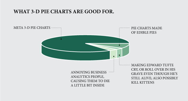
Aside to the 3 arguments above, there are more details showing how pie charts are not the best choice. and 3D pie charts? Let the chart below explain everything :)


Suck on that, Conway.

You can follow the rest of the story on pie charts here and also here

All images are taken directly from the source blogs to the credit of the authors.

Wednesday, 23 May 2012

Custom Labels

Sometimes, you need just a little bit more information or formatting to your labels than just raw numbers.


Tableau allows you virtually infinite ways to customize and display your labels to your desires.


To customize your label, all you have to do is construct your desired label in a calculated field.


For those familiar with programming, the text is treated like a String, for those unfamiliar, textual information must be inside an apostrophe e.g. ' insert text here '


To mix between textual information and those from your data, use '+' to combine between the two.

Remember, even a new line can be inserted into the label when put inside the text bracket.


Hope this helps, Good day :)