The main reason when we visualize information in charts or graphs is to make it easier to interpret and compare information within, however, using Pie Charts have proven the opposite. Why? As
Steve Fenton puts it
1. Pie charts made it difficult to compare individual values.

As this example taken from the
2009 BBC News European Election Results suggests,
even though it is reasonably clear that the Conservative Party has the biggest chunk of the vote, it is definitely hard to see the difference between the next three parties, UKIP, Labour and the Liberal Democrats. It is also quite hard to tell the difference between the next two parties, Green and BNP. As the purpose of the chart is to tell the differences between each party, using a pie chart proves to difficult in achieving this.

Now if we compare to the bar chart above, it is so much easier to see the difference between the items.
2. The size of a pie chart wouldn't make any difference.

 From the same data as above, resizing a pie chart would not reveal anymore data, and the space taken to resize just to make it clear would only be a waste.


Compared to the bar charts above, the smaller chart is already showing a clear difference between the columns, but when enlarged you'd get a more clearer picture of the differences.
3. Displaying combined values.

From the
2009 BBC News European Election Results above, if we wanted to see how would the Conservative party fare when say the Labour party were to join forces with the Liberal Democrats, its very hard to tell using the pie chart above.
 If we observe the same using our bar chart, we can clearly see that the combined party could have an edge over the Conservative party.
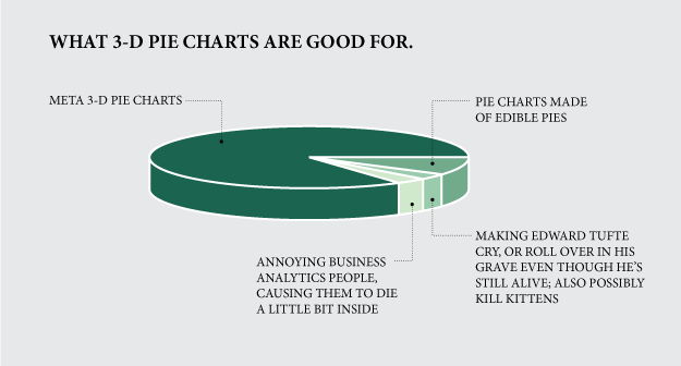
Aside to the 3 arguments above, there are more details showing how pie charts are not the best choice. and 3D pie charts? Let the chart below explain everything :)
If we observe the same using our bar chart, we can clearly see that the combined party could have an edge over the Conservative party.
Aside to the 3 arguments above, there are more details showing how pie charts are not the best choice. and 3D pie charts? Let the chart below explain everything :)
You can follow the rest of the story on pie charts
here and also
here
All images are taken directly from the source blogs to the credit of the authors.
